“What’s the Starbucks font?” sounds like a simple question — but there are actually two answers:
- The Starbucks logo / wordmark (custom lettering — not a regular “downloadable” font)
- Starbucks brand typography used across packaging, signage, and marketing
1) Starbucks brand fonts (the official answer)
Starbucks uses proprietary typefaces across its brand system. In their own creative expression guide, Starbucks lists three fonts:
- SoDo Sans (primary sans-serif)
- Lander (serif for more expressive moments)
- Pike (a more condensed, functional headline/wayfinding style)
Source: Starbucks Creative Expression (Typography). These fonts are part of their internal brand system and aren’t meant as a public “free font download.”
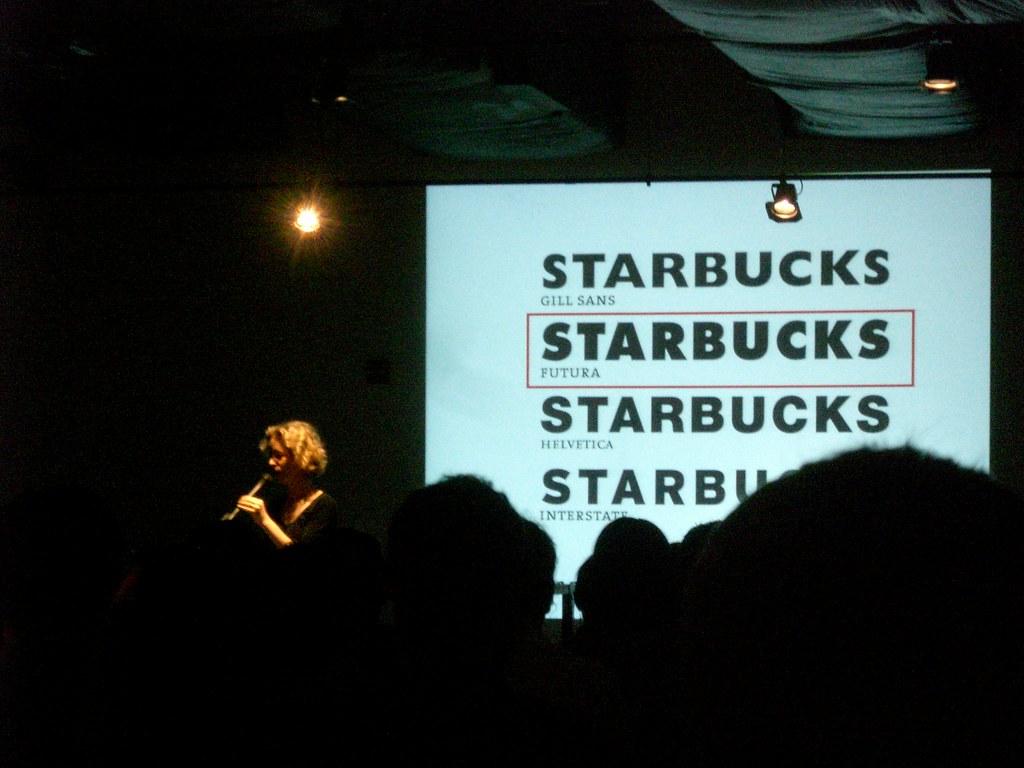
2) What about the Starbucks logo font?
In many modern applications the main siren mark appears without text. When text is used (for example in legacy wordmarks or specific applications), the lettering is typically treated as a custom wordmark — not the same thing as “the font Starbucks uses for everything.”
That’s why many “Starbucks font download” pages online disagree: they’re usually guessing the closest match, not describing an official public font.
3) Closest look-alikes you can use (safe alternatives)
If you’re designing something with a “Starbucks-ish” feel (clean, friendly, modern), here are practical alternatives that work well:
For SoDo Sans vibes (clean, modern sans)
- Inter (free, modern, very readable)
- Source Sans 3 (free, versatile)
- Helvetica / Arial (basic but works in a pinch)
For Pike vibes (condensed, functional headlines)
- Archivo Narrow (free, very usable)
- Oswald (free, classic condensed headline look)
- Bebas Neue (free, bold display option)
For Lander vibes (expressive serif)
- Merriweather (free, friendly serif)
- Libre Baskerville (free, classic)
- Georgia (default, surprisingly decent)
4) A quick note on trademark & “Starbucks-like” design
If you’re using these fonts for personal projects or inspiration — great. But if you’re designing branding for a coffee business, avoid copying Starbucks too closely (names, siren imagery, green palette + layout patterns). It’s easy to cross the line from “inspired” to “confusingly similar.”
FAQ
Can I download the official Starbucks fonts?
Starbucks’ brand fonts are proprietary and intended for Starbucks materials. For most designers, the best move is to use high-quality look-alikes (like Inter / Source Sans / Archivo Narrow).
Why do websites claim different “Starbucks logo fonts”?
Because many are guessing the nearest match to a custom wordmark or older applications. The brand system fonts and the logo lettering aren’t the same problem.
Editor’s note (2026 refresh): This post focuses on clarity: official brand typography vs. “closest match” guesses. If you want, I can also suggest a simple type pairing (headline + body) that gives a premium café vibe without looking like a Starbucks clone.